ABOUT
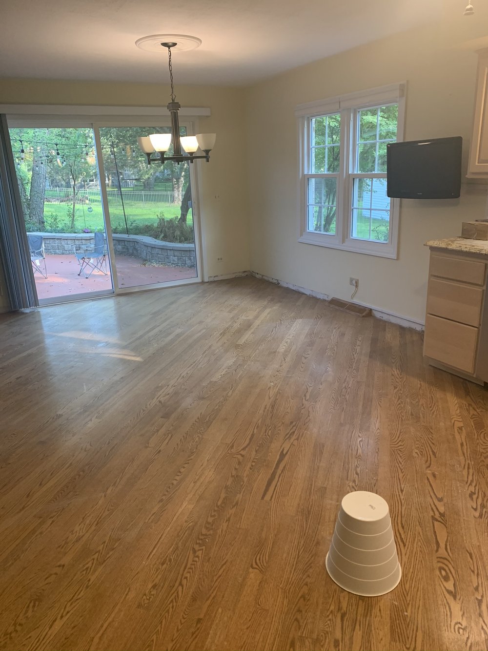
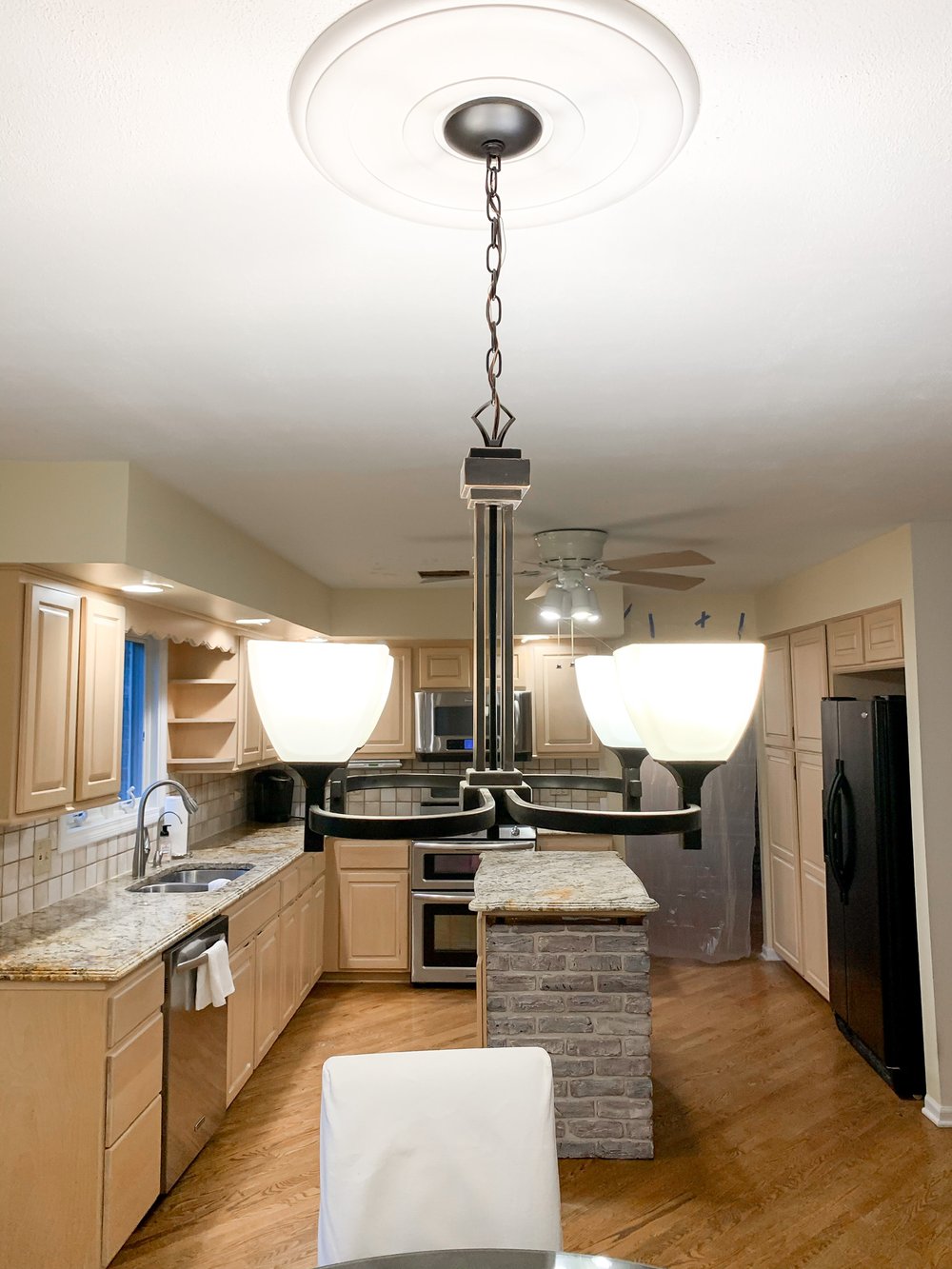
We recently moved across the country to the Chicago Suburbs area. When we looked at homes on our brief tours, I knew most of our home options would need some sort of remodeling done. We moved right before the pandemic not knowing that everything including restaurants would be closed. My design process went through a few revisions before we decided on our favorite. My kitchen remodel was inspired by a combination of some of my favorite things. Here is a view into our kitchen before we remodeled it
INSPIRATION
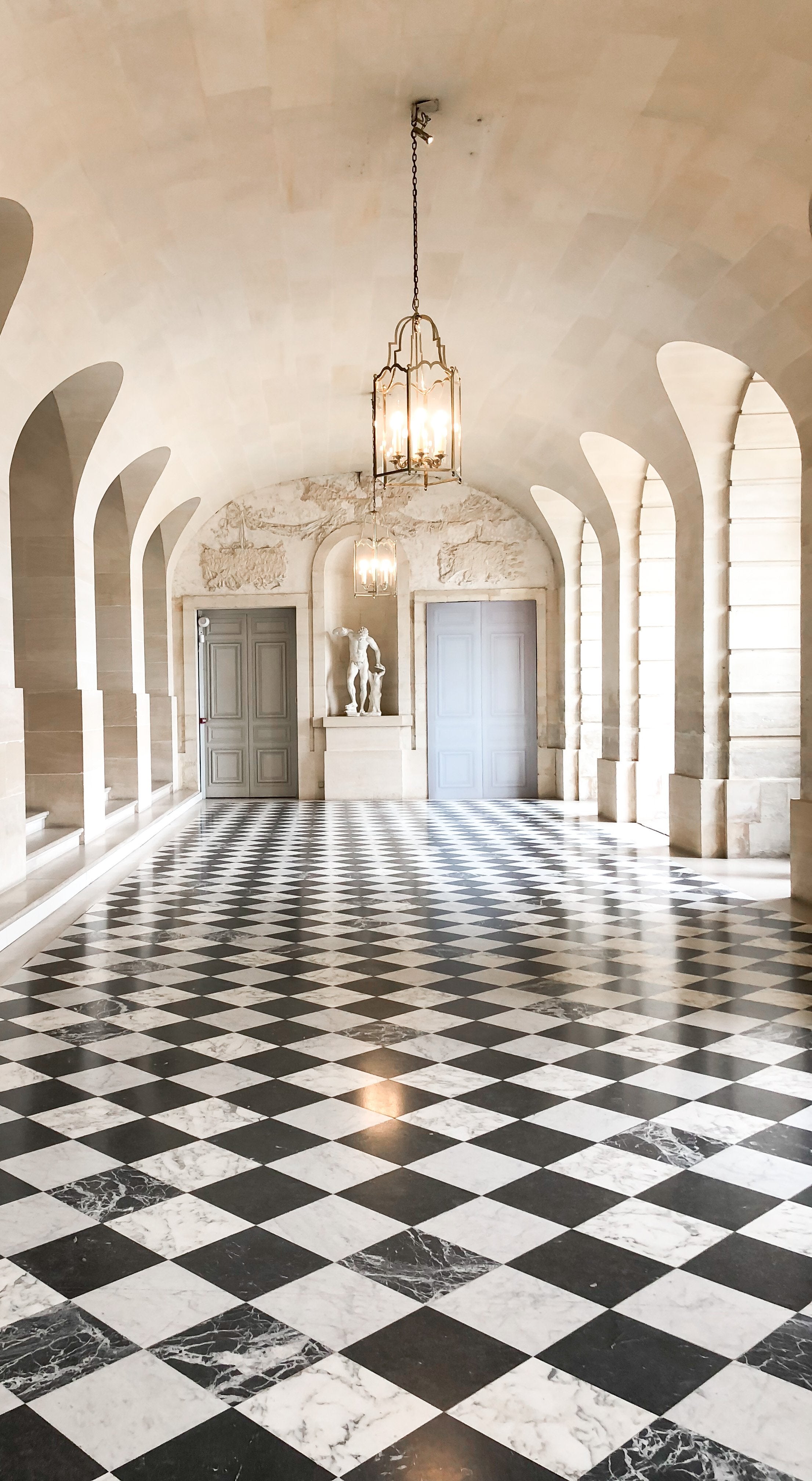
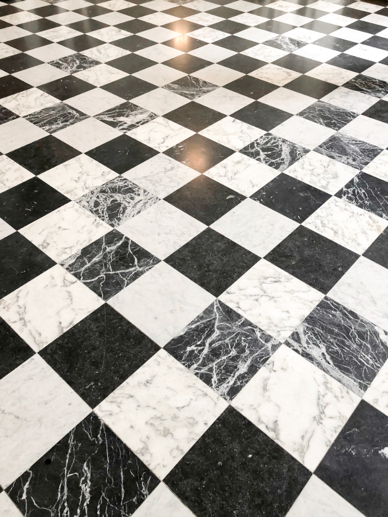
My inspiration came from a few perspectives… I was inspired by my travels, particularly France where I toured Marie Antoinette’s Versaille The Queen’s New Apartment. I loved the contrast of the black and white floor (see my entry way;) and the beautiful blue doors with a simple cream background in the corridors of the home. I wish I lived here! So the next best thing was to create something I love while keeping it simple and functional. During this time of designing my kitchen the pandemic began! The limitation of working outside the home on top of area restaurants being closed for months lead to my decision to open up the kitchen to be more expansive and create seating areas similar to a cafe. I wanted an area where we could work, eat, and mingle. We also wanted our kitchen to not just be organized and functional but a staple for conversation and connection.
THE CABINETRY
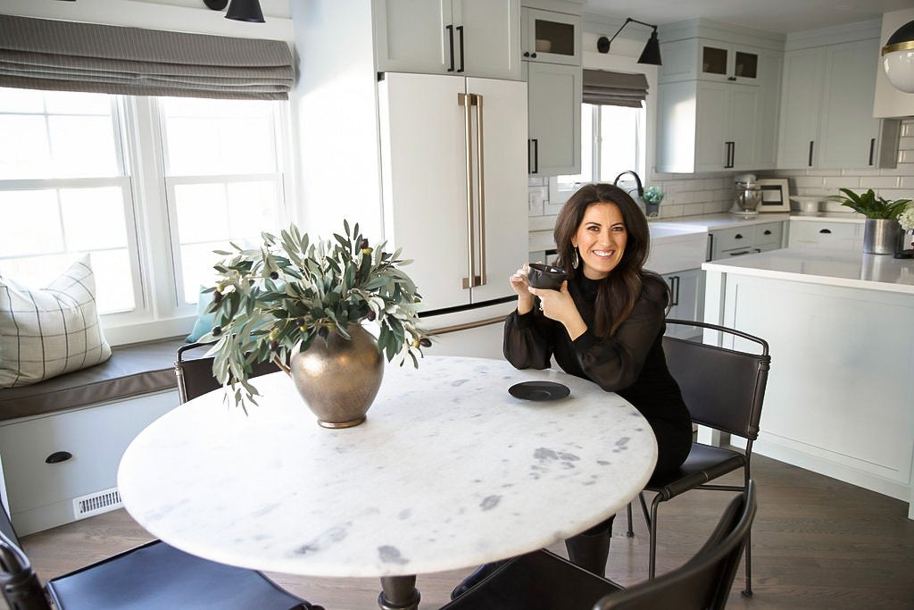
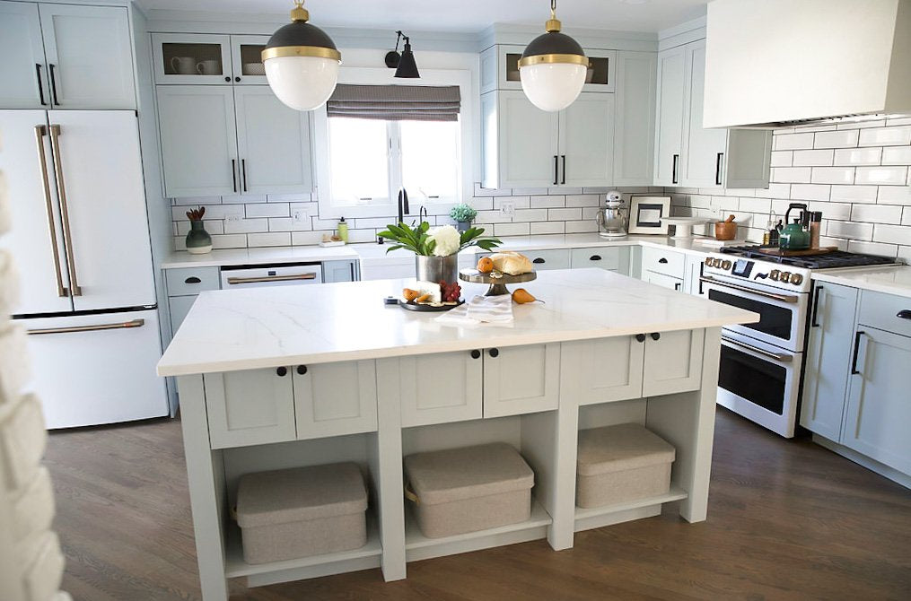
During this time, our cabinetry line introduced a new light blue color called Whimsy. I wanted something unique, bright, airy, and timeless so I committed all the way with this beautiful light blue color and completed the whole kitchen! We went with full height cabinets and added gold wire mesh to above cabinets to accent the black and gold cafe inspired pendant lights. I wanted a few gold accents and to add interest so I opted for gold wire mesh in the upper cabinets with LED lights to accent the simple white dishes. I utilized the dining space as an extension of the kitchen. Spanning cabinets across the area with built in seating. A pantry with built in storage for small appliances.
LIGHTING
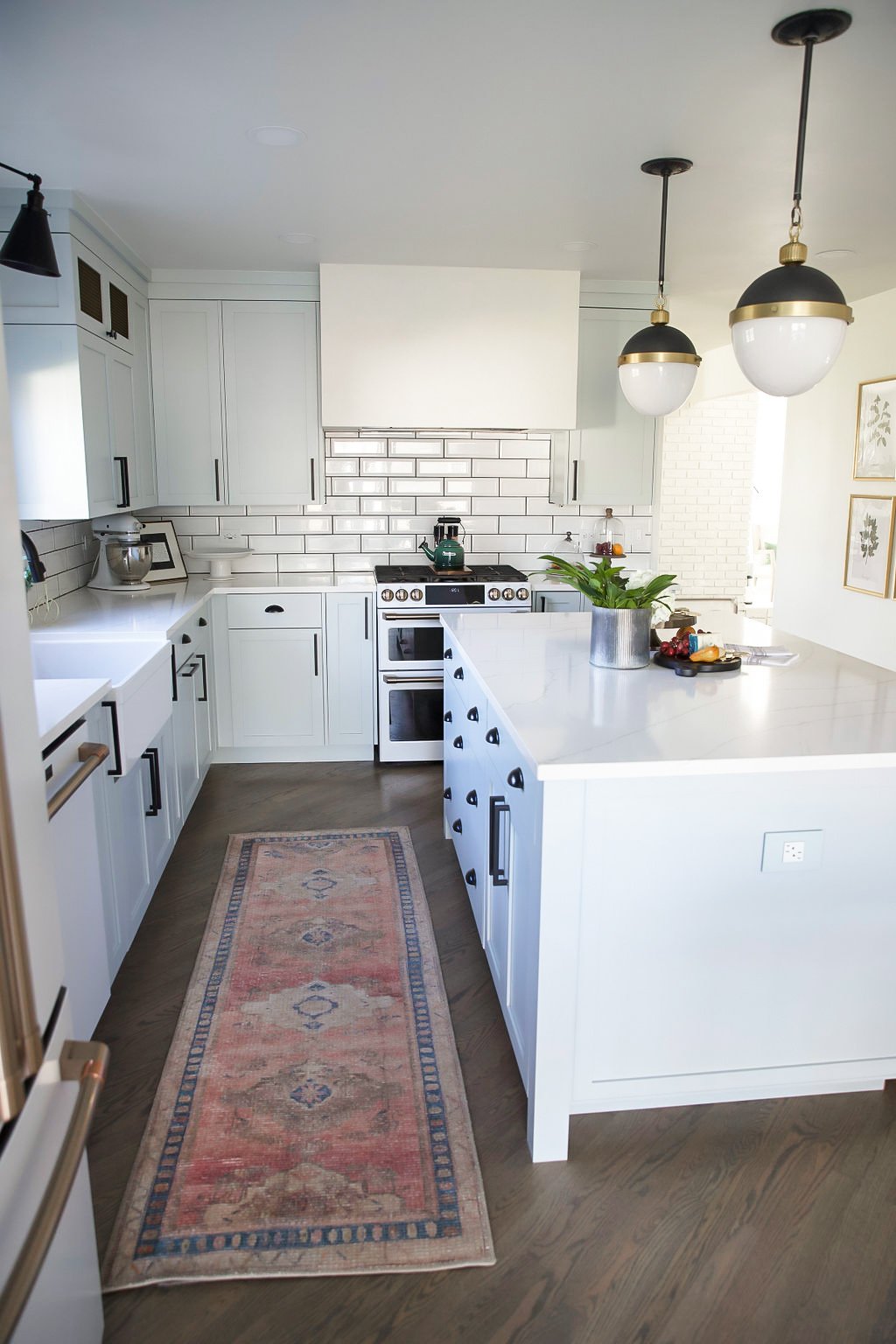
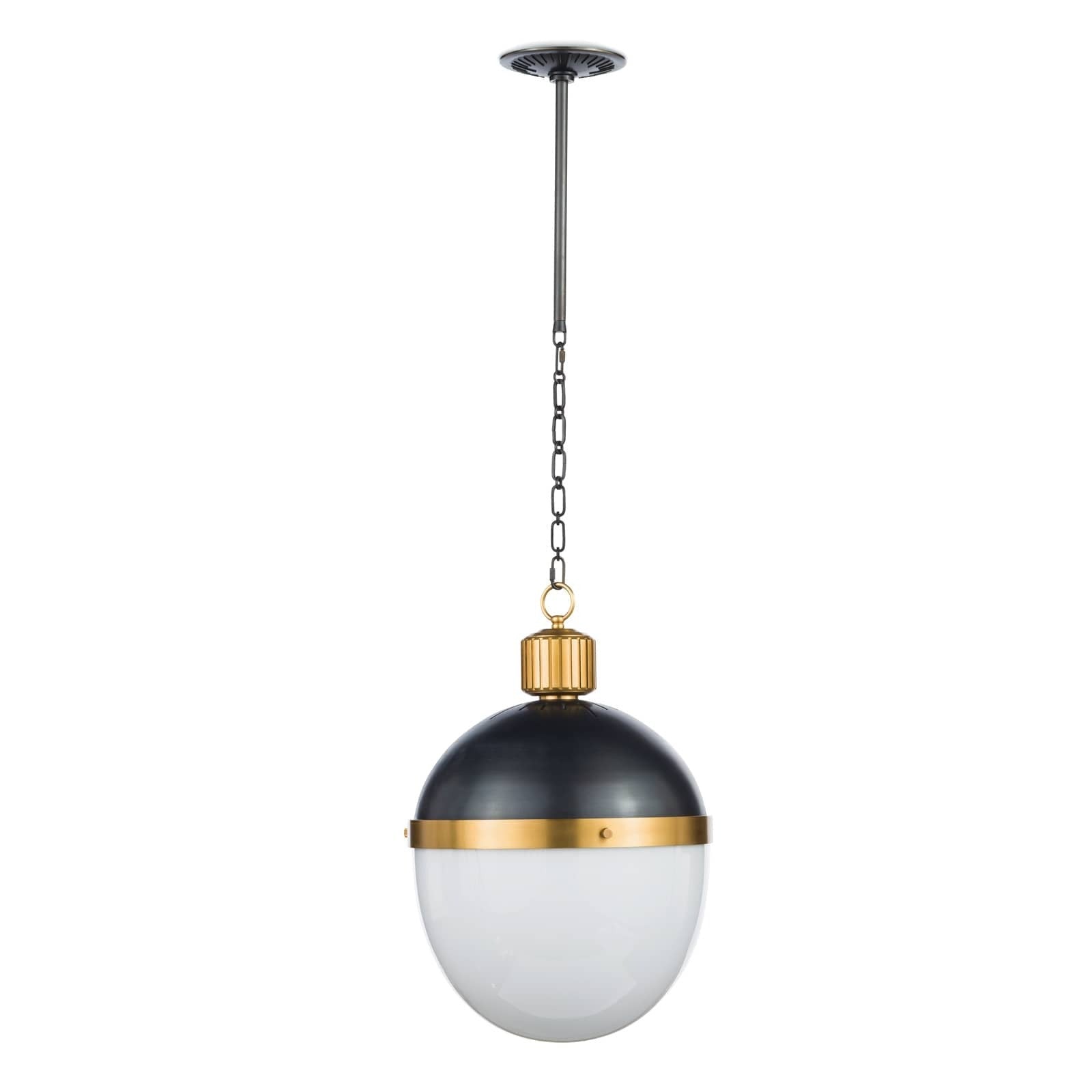
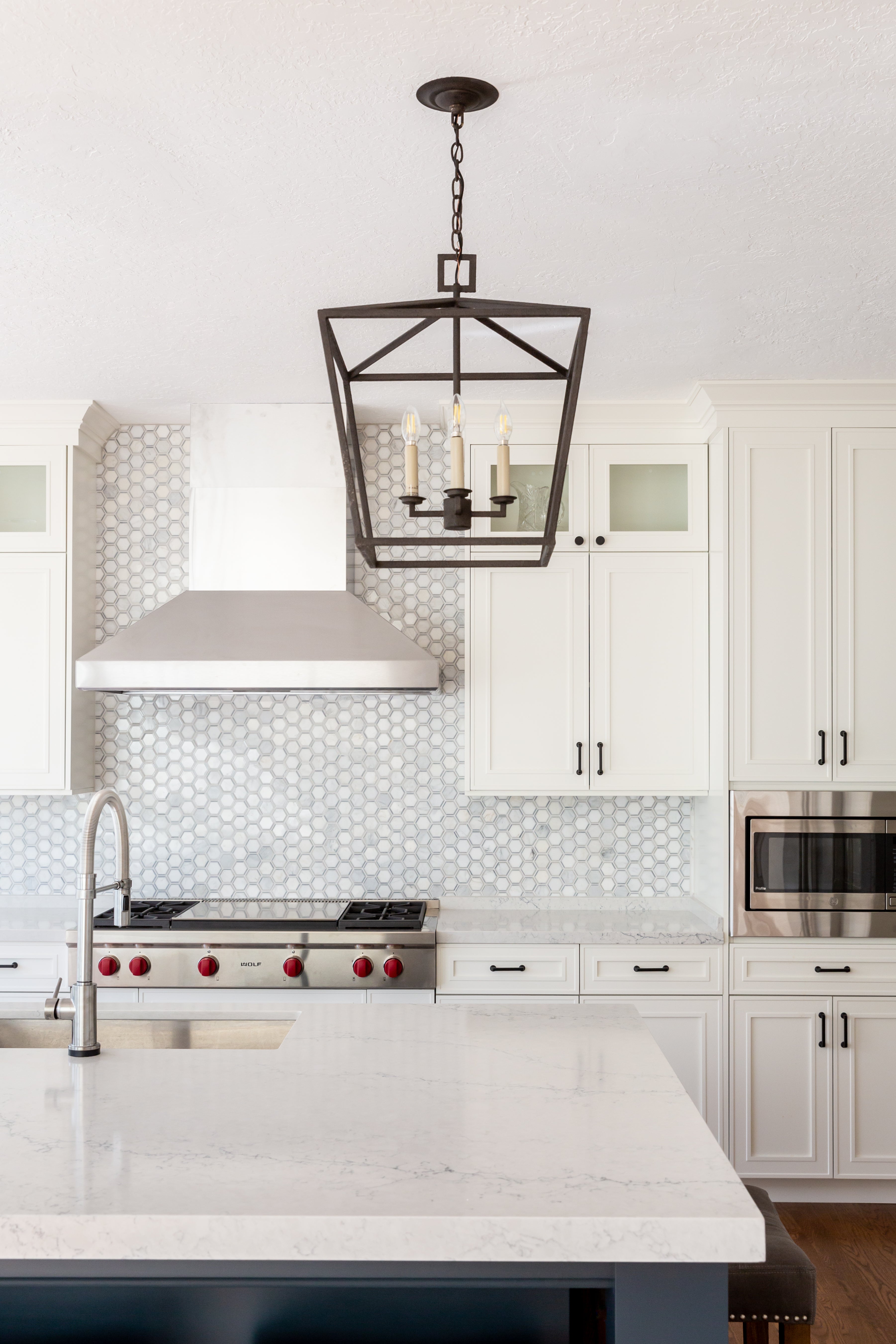
I wanted to create an area to read and enjoy apart of the conversation so I created a bench to connect the kitchen to the built in pantry. I even included a USB outlet for charging…because I know my teens so well! I designed the island to be expanded from the original footprint for additional seating and counter use. Complete with additional storage cabinets in the back with shelves for baskets. Previously, there was only a dining light, a fan over the island, and a few lights over the counter tops. We needed more lighting! So, I designed the kitchen with a few layers of lighting including LED Lights and multiple accent lighting. I just love these Cafe inspired pendant lights!
THE APPLIANCES
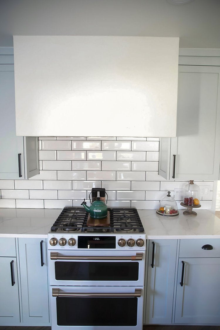
I had been eyeing the GE Cafe White appliances with gold hardware and couldn’t wait to use them for my own home. I like that GE offers upgrades to their ranges with their app and after we received our range, we got an upgrade to do air frying in our lower oven! I usually like to implement double ovens into my kitchen designs but where space is limited this was a great solution! I love the look of white marble so these quartz countertops were a win! We used them on the perimeter and the island for a seamless look. We also made a custom plaster hood to go over the range! It’s not always as easy as it looks to pull off custom items but he did a great job. I really wanted a functional organized kitchen so I added spaces like a baking center, spice drawer, utensil pull out, baking sheets divider, and hidden double trash pull out. My hubby also completed the subway backsplash complete with contrasting grout to add a little dimension. Again, he did a fabulous job! I accessorized with some of my favorite pieces from Blanc Noir shop and wha la… it’s done!

- Choosing a selection results in a full page refresh.
- Opens in a new window.

SHARE